Despite attempts to pin down a single hue as the modern favourite, ombré has been slowly but surely overtaking contemporary colour schemes. With people demonstrating increasingly ambivalent feelings towards futuristic design, brands are incorporating ombré into their interfaces to help them modernise, but with a hint of nostalgia thrown in for good measure.
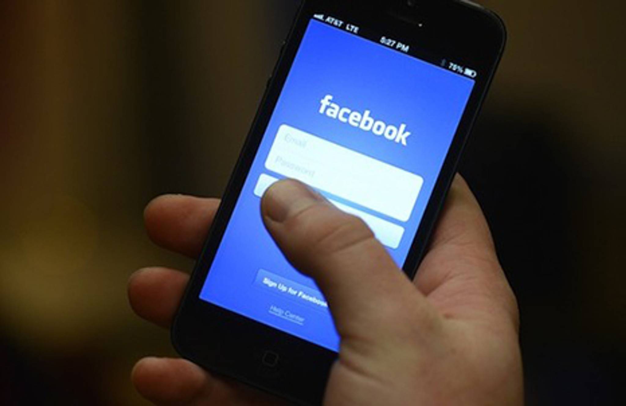
While 2016 saw the proliferation of rose gold products, ombré colour schemes are popping up everywhere – from Pandora’s new logo to the Spotify home page. What remains to be seen is whether they'll stick; 67% of Instagram users said they preferred the logo that preceded its current ombré look. Tech companies pushed ‘millennium pink’ as the colour to usher in a new era (which Instagram is also championing), but ombré’s prevalence shows people are being drawn towards a colour scheme that errs less on the side of sleek and modern, and more towards a retro aesthetic. “I suspect the current trend has something to do with ‘70s and ‘80s nostalgia,” says Hamish Smyth, graphic designer for New York City’s Fulton transit center. “Colourful gradients look a lot like the computer games and graphics of that time period. Think Miami Vice meets Tron.”
Nostalgia has always been a quick route into people’s hearts, with studies showing that feeling nostalgic provokes pleasant memories and makes people more willing to spend. And with 2016 widely regarded as a terrible year, reminiscing about better times is becoming more appealing than ever. The popularity of ombré’s retro look comes at a time when both the idea and the aesthetic of the future seem threatening. Just as robot design has won people’s trust by opting for cuteness rather than futurism, self-consciously modern colours like 'millenium pink' are giving way to colour gradients with an old-school charm.
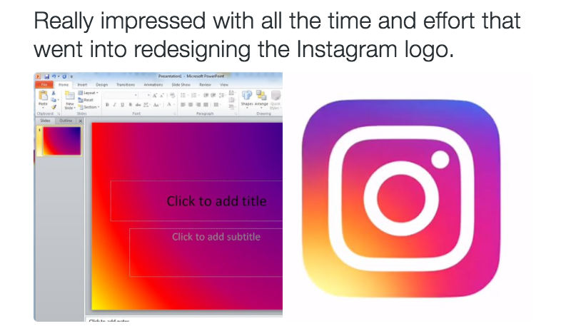
That said, the internet isn’t always impressed with a simple throwback to days past. Ombré’s fading gradients and vivid colours might evoke ‘80s nostalgia for some and ‘60s psychedelia for others, but many users found Instagram’s new logo just plain lazy. A viral tweet pointed out that the app’s entire rebranding amounted to little more than pinching a default template off of Microsoft Powerpoint and slapping a white square on it. Although ombré’s appeal is that it doesn’t try too hard to be modern, Instagram’s ombré-only design risks looking like it isn’t trying at all.
Mira Kopolovic is a writer and researcher, with an MA in creative industries, which focused on artist-brand collaborations. She spends her spare time poring over dystopian literature.